Making the handbook handy: revising the BSB Handbook to be readable for humans
Elijah Granet explains why he decided to create a more convenient and readable edition of the Bar Standards Board Handbook… Continue reading
Introduction
The Bar of England & Wales is a fantastically varied profession, encompassing literally every area of the law, both in general (eg, criminal, civil, or family), to the immensely specific (admiralty, Privy Council work, ecclesiastical law). It also takes in both employed and self-employed barristers, as well as many non-practising barristers who do not directly work in the law. There is no single statute or regulation which applies to the work of all these disparate groups, except the Bar Standards Board Handbook, which governs all members of the profession, as well as the education and training of those aspiring to join it. Yet, this crucial document, which contains the basic ethical rules for practising in England & Wales (and forms the substance of a difficult exam Bar students are required to take), is available online only as a horrendously formatted website, or as a PDF which is nothing more than a series of printouts of said website.
As a matter of public policy and common sense, doing the right thing should always be made as easy as possible. The Handbook in its default format was so difficult and discomforting to read that it was discouraging practitioners from consulting. Faced with this problem, I chose to take the initiative to create a version of the Handbook which would be eminently readable, and clearly and prettily display this vitally important content.
The Process
The first step was to try to corral all of the Handbook’s contents together. My sacrosanct principle was that I would not change one tittle or jot of the Handbook. This occasionally became difficult when I came across errors (especially one instance where a provision is set out with identical wording twice in a row) in the original version, but I managed to resist the temptation.
My goal was to transform the HTML Handbook into a LaTeX file (LaTeX is a typesetting programme for creating beautiful documents via code). This was theoretically straightforward using the pandoc (a utility for converting text documents), but proved to be extremely difficult in practice because of continued issues with pandoc attaching irrelevant markup to what ought to have been relatively plain text. My next approach, which was somewhat successful, was to use a series of Regex (regular expressions, which allow for more flexible searching) search and replace commands to bring some logic to section headers. However, this simply did not work with the most difficult and frustrating part of the Handbook: nested lists. Unfortunately, the Handbook is very inconsistent in lists—some are marked online with merely a full stop before a letter (eg, .1), others feature characters in parentheses, and there are a few points where the start of a roman list can be confused with the letter ‘i’. So, in the end, I had to go through each part of the Handbook and shepherd each nested list into place. It was rather tedious, although I do now know the Handbook quite well, and eventually I had something resembling a coherent text. Part VI of the Handbook posed something of a challenge, because it is really a glossary rather than a series of sequential rules and headings, so I had to then create a different layout to accommodate the unique nature of the word/definition structure, which took some more time (as did inserting chapter breaks at each different letter).
The next step was optimising the Handbook for ease of use. I settled on a colour-coding scheme (red for rules, blue for outcomes, grey for guidance, and gold for Core Duties) designed to catch the reader’s eye, and bolded and coloured instances of mandates (eg, ‘you must not’) so that readers would not miss crucial directions.
For the typeface, I settled on a public domain version of the official typeface of UK statutes, ‘Palatine Parliamentary’ (which I had previously created). This has the advantage of not only being an eminently readable face, but also of lending the Handbook the gravitas and air of an Act of Parliament; this is appropriate given the fact that the Handbook essentially has the force of legislation for persons and bodies regulated by the BSB. The layout was conservative and sparse, but always clear. I used a standard 1 m indent and tried to sustain justification everywhere (although it was tested by triply nested lists in places).
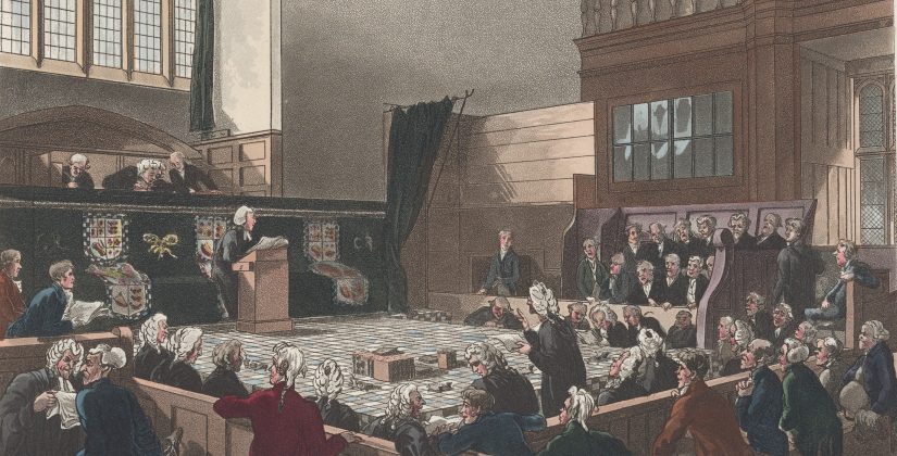
Finally, for the cover, I had a bit of fun, because I think even a staid book of conduct rules should have at least one visually striking image. More seriously, the dignity and power of the Handbook deserves some authority and gravitas at its front. I selected the public domain image of the Thomas Rowlandson etching Court of Exchequer, Westminster Hall (1808), which captures a pleasing snapshot of barristers at work.
The Outcome
The point of all my work–and this did end up taking a day and a half of rather tediously sorting out stray provisions—was to make it as easy as possible to read the Handbook. When text is well set out, nicely organised, and generally easy to navigate, people will read it more. This is why virtually every lawyer in this jurisdiction prefers a nicely laid out ICLR report—typeset so neatly in Sabon with tables of cases and clear headings—to the High Court judgment template, whose Microsoft Word pseudo-justification means words are randomly stretched out or squished together. Lawyers can often overlook things like typography or readability, which leads to documents repugnant to the human eye. Just like the best advocates have pleasing voices (think of the soothing tones of say, Lord Pannick QC), the best legal documents look nice. A comprehensible and clear Handbook is more effective at its job of telling barristers the rules and professional ethics which protect both the public and our system of justice.
The Handbook is available here.